

Figma • Adobe Creative Suite • Design Lead • SAFe Agile
Goal
Operations Watch List (OWL) mobile app delivers real-time insights and alerts for on-the-go decision-making. A redesign was needed to increase app utilization and enhance care efficiency.
Objective
To enhance usability, streamline user flows, and help providers deliver efficient, patient-centered care within a six-month design and development timeframe.
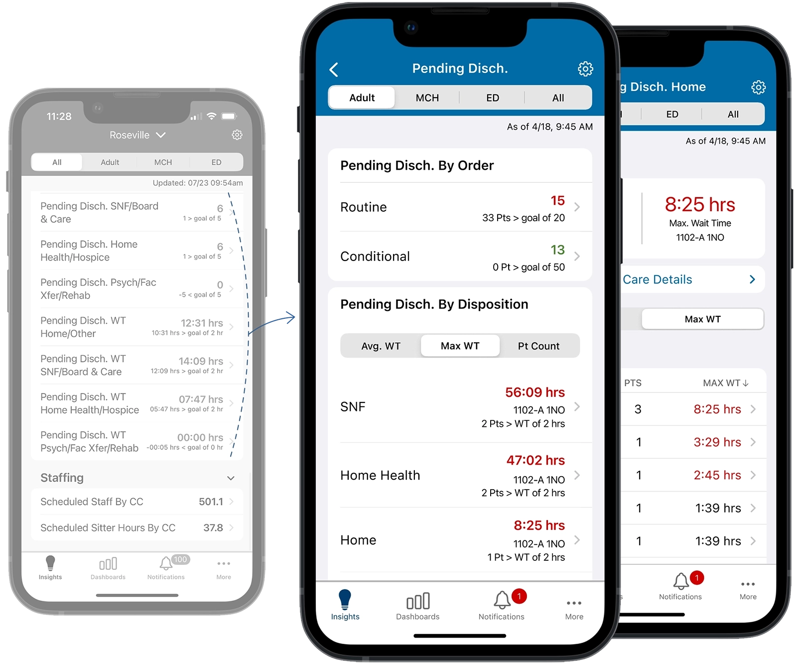
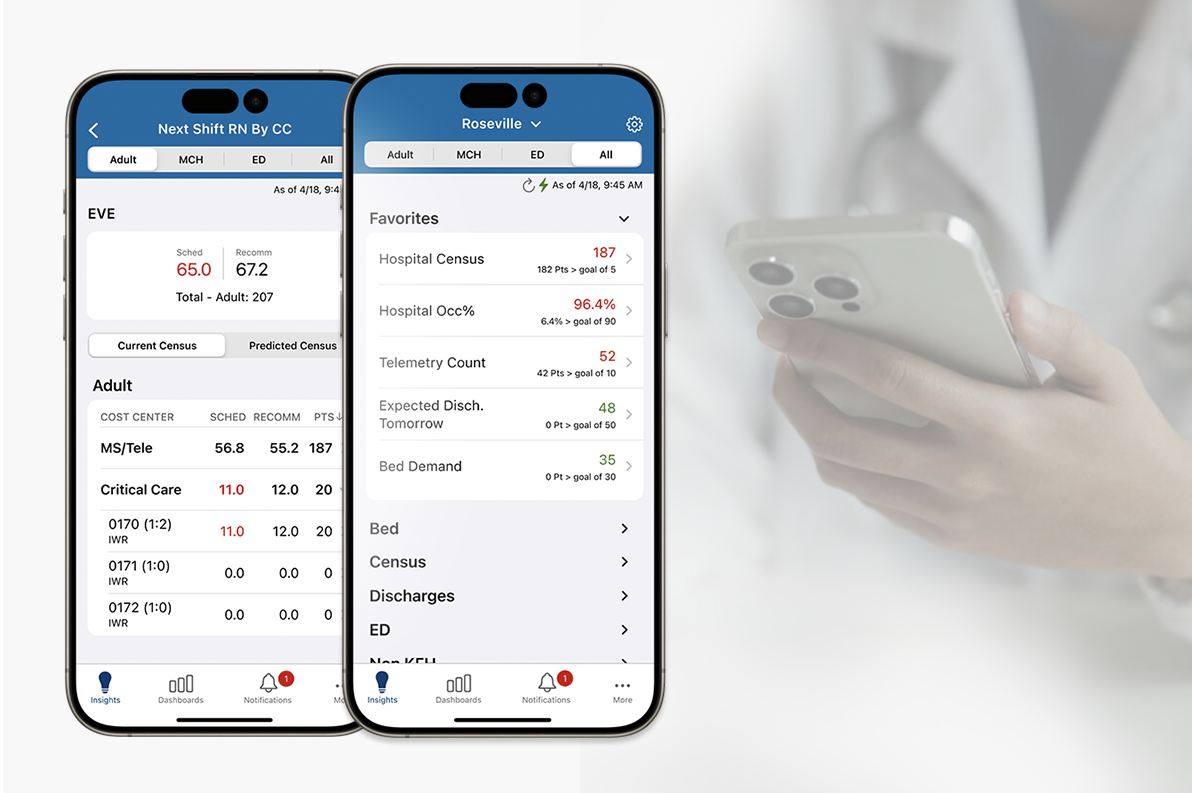
Replaced a cluttered, repetitive list of discharge metrics with a unified dashboard. This redesign simplifies the UI and provides a clear, department-level overview of patient flow.
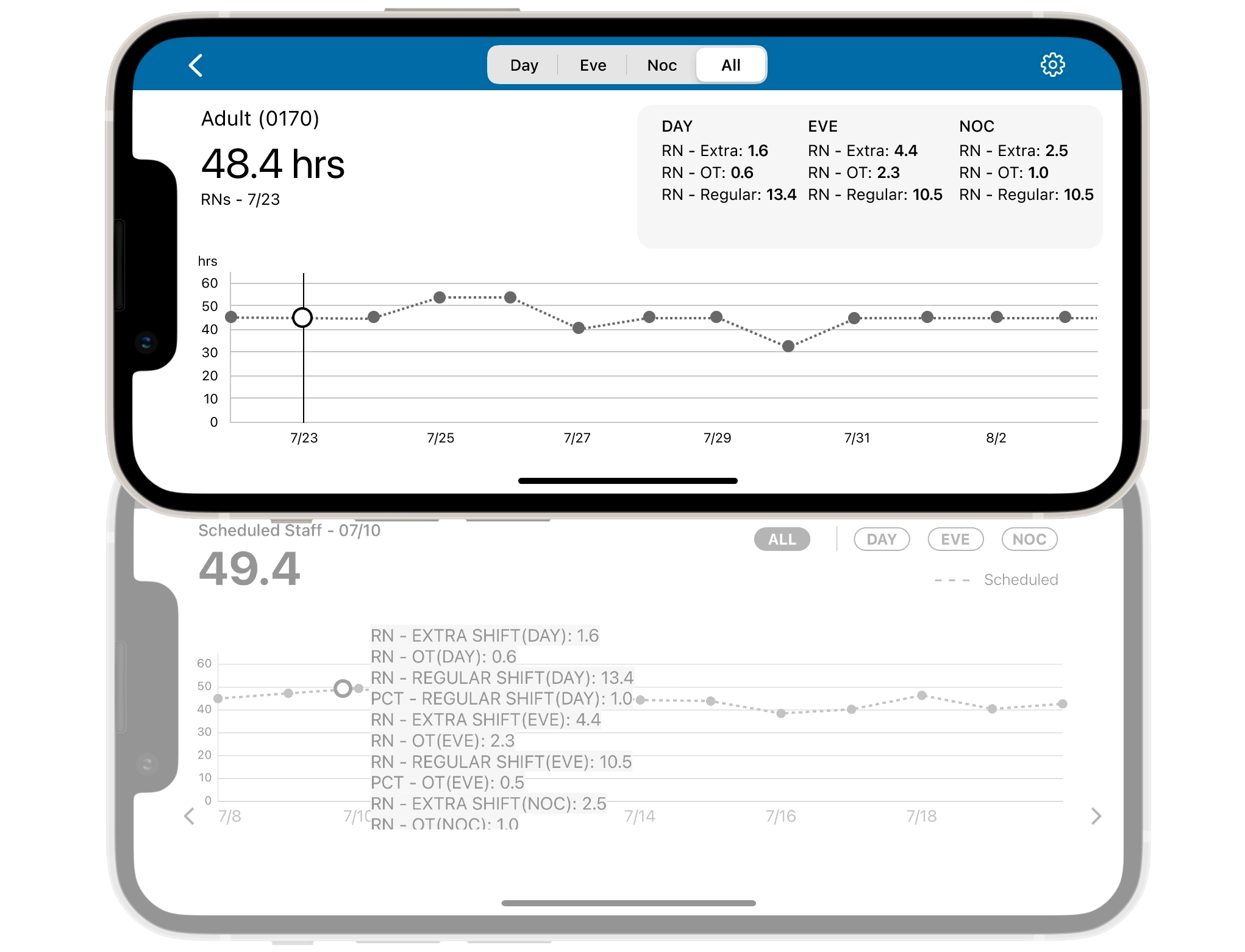
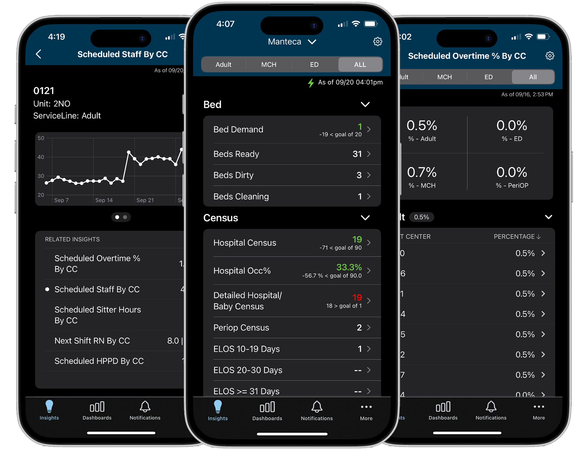
Consolidated Historical, Live, and Predictive staffing metrics into one location. Replaced truncated views with a drag-to-navigate timeline for a continuous, comprehensive overview.
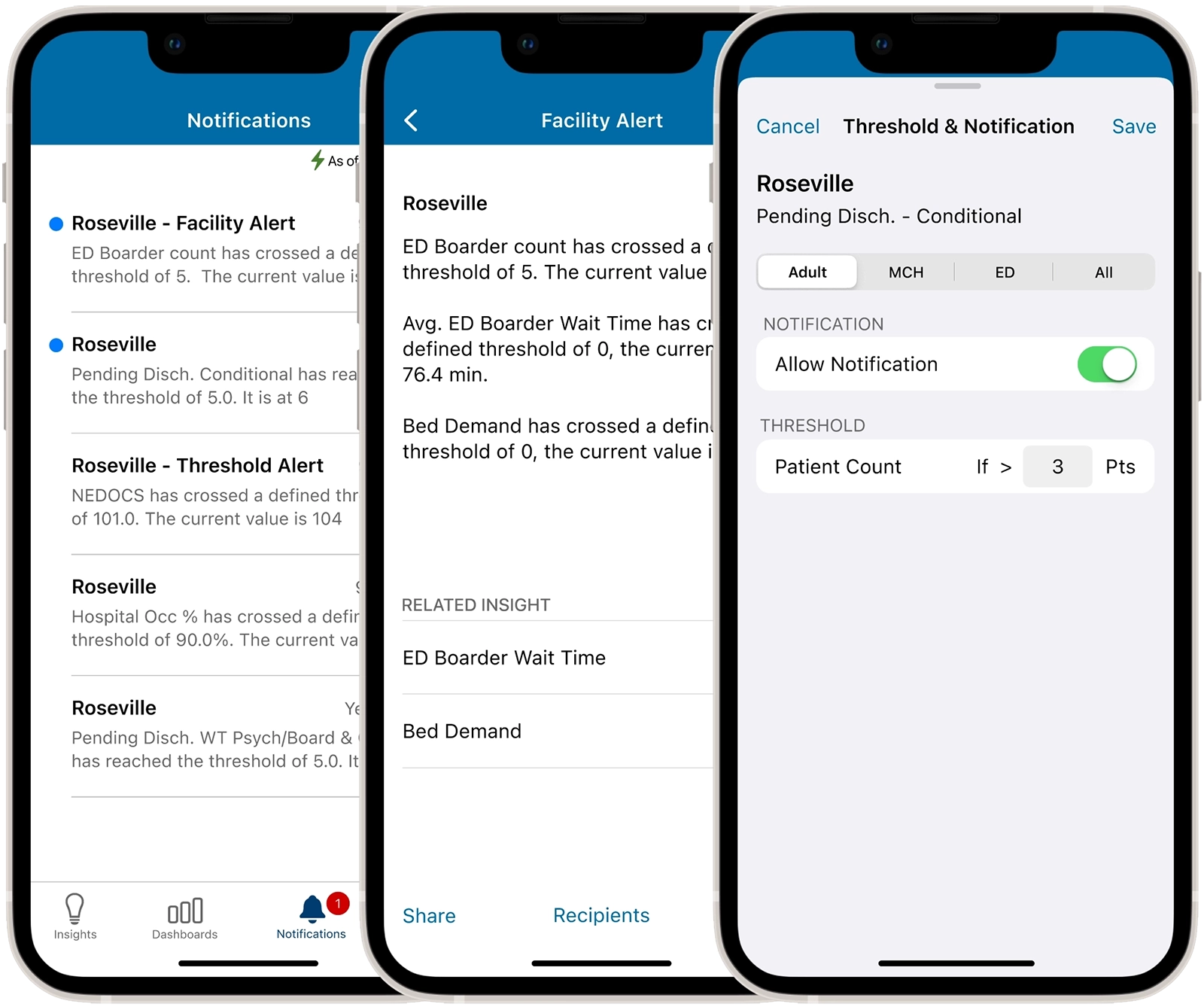
Redesigned to support targeted alert notifications, allowing designated recipients to access department related metrics and collaborate efficiently within the medical center.
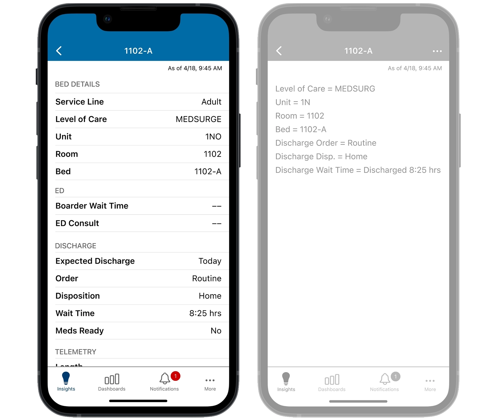
A privacy-first redesign of the bed details view that provides a consistent, readable overview of patient insights without exposing PHI.
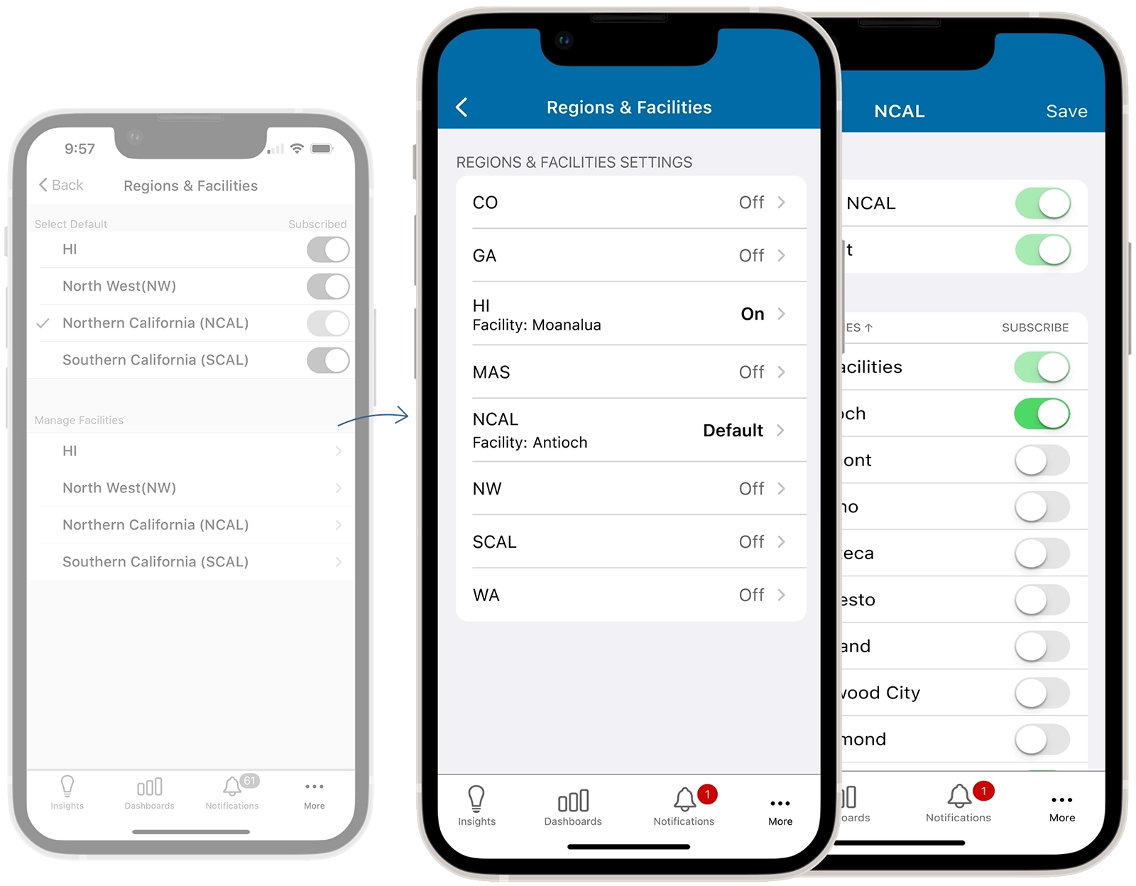
Reduced a complex, multi-screen flow into a single-screen interface. Enabled intuitive management of multiple regions and facilities, eliminating user confusion.
Provided a dark mode version for dim environments to minimize disruption to patients’ sleep and preserve staff night vision, while maintaining readability of critical information.
The OWL redesign elevates the user experience through streamlined flows and refined usability. This ensures hospitalists can manage throughput and reduce staffing costs with maximum efficiency.